When Arete were beginning to typeset the…
When Arete were beginning to typeset the metal monotype for The Case of Death and Honey, which was a long process, we were talking to Neil Gaiman that metal type is perfect for the meditation that poems require. Together we thought that we’d like to do some poems that were to be set in metal. A good idea.
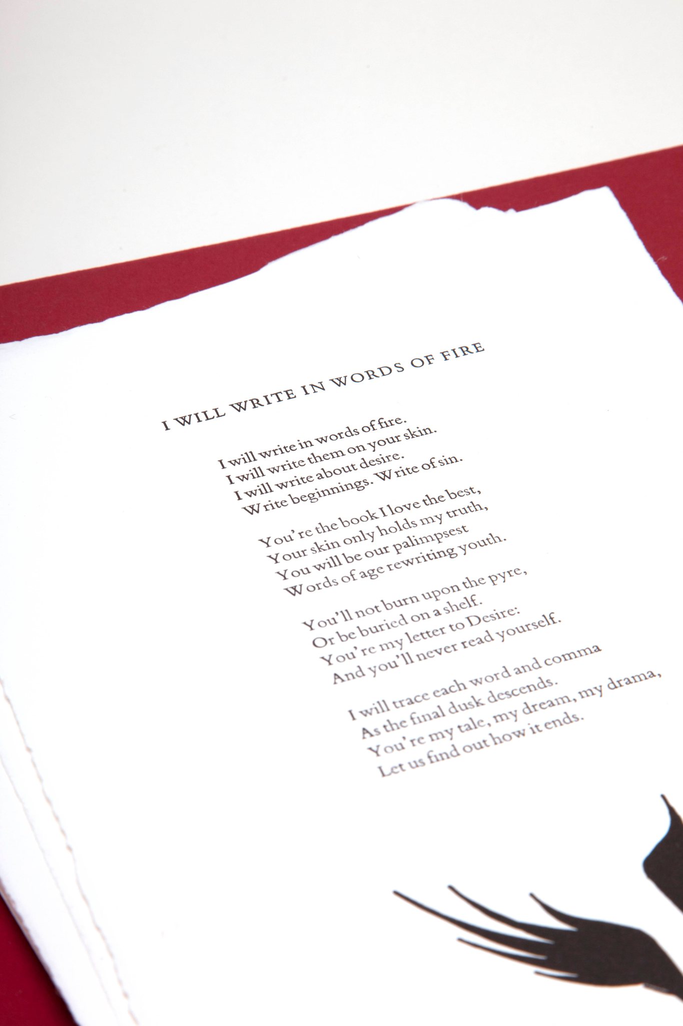
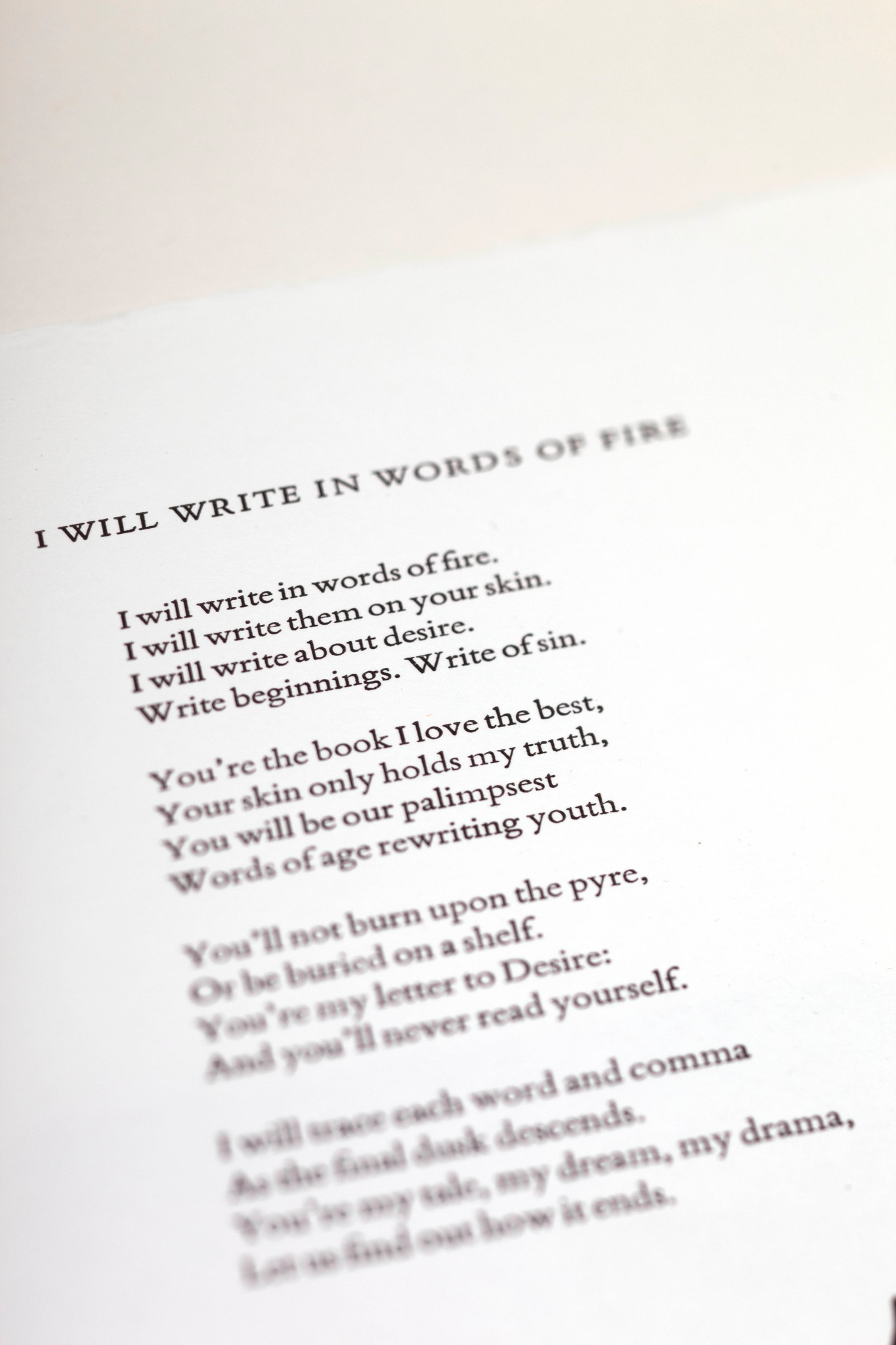
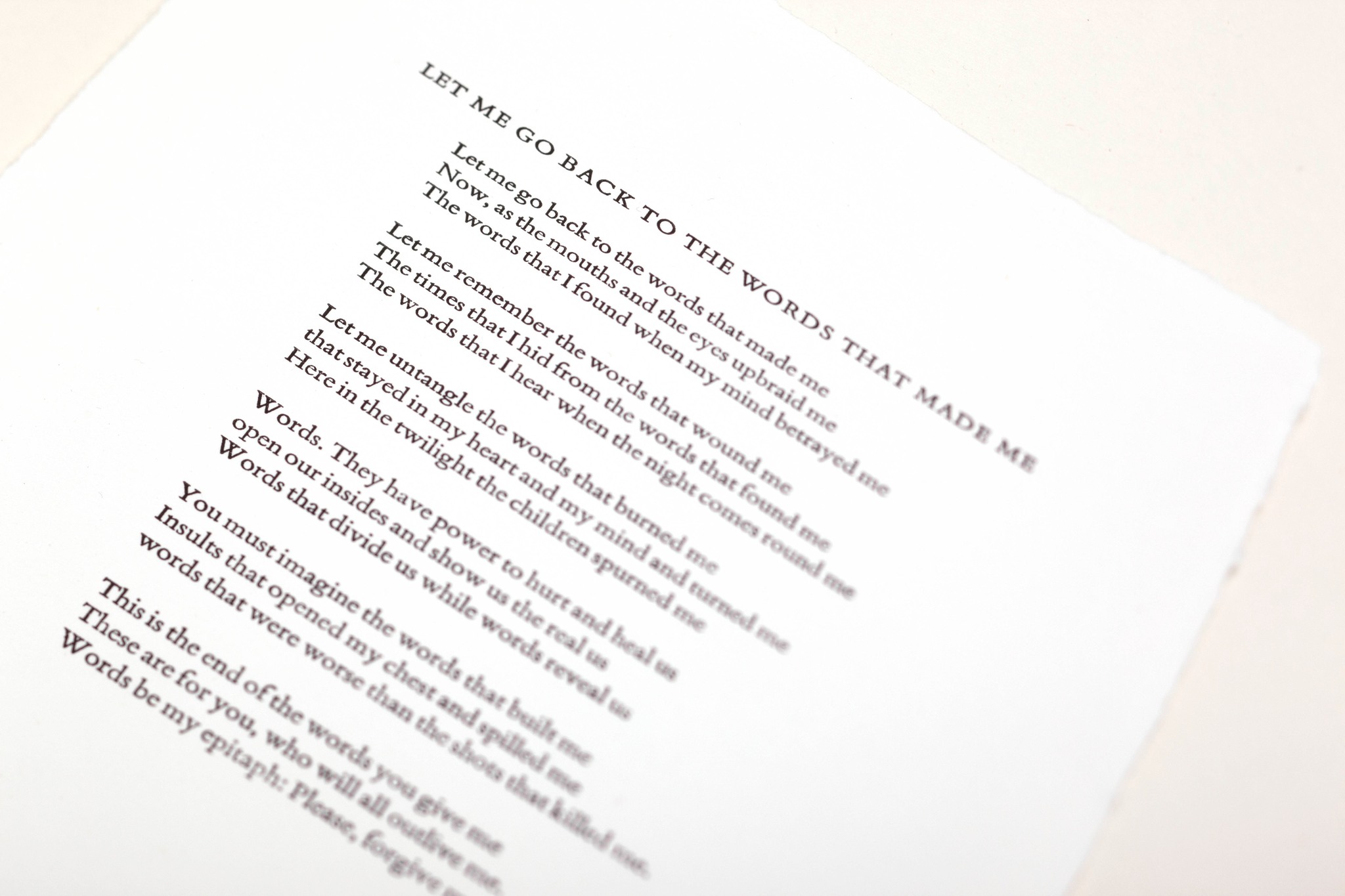
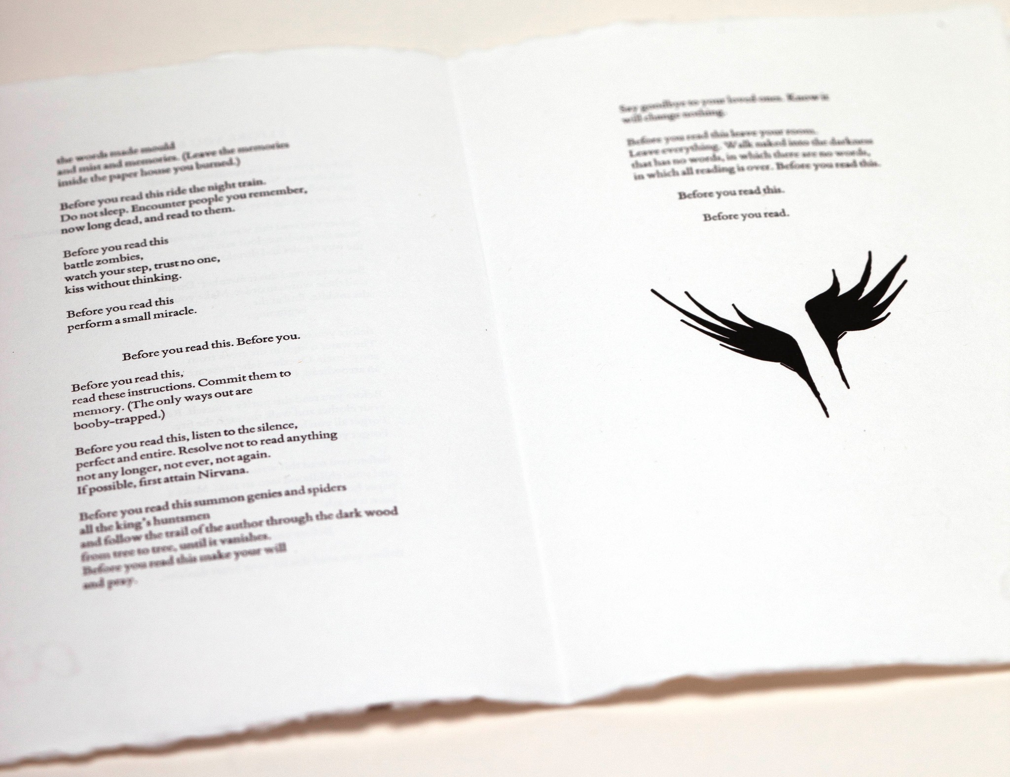
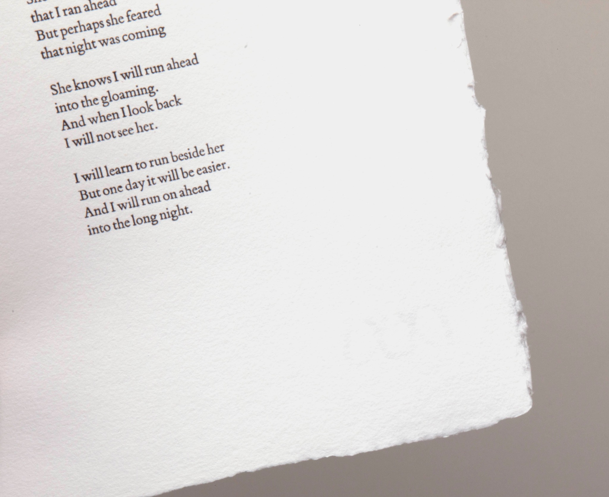
This project was all about the words. Letterpress is great for poems, the beauty of the printing from metal type, we think, enhances the power of the words by the poet.
Neil chose a personal selection of poems he’d like to see done this way and initially it was to be a chap book.
However, the time and attendant costs involved meant that the traditional way of making a chap book, (softcover, stitched, usually one folio, and ours was much more than one sixteen-page folio) that we decided to make them as more substantial books. But we wanted them to still be handmade. And affordable, well, as much as possible for Metal type letterpress can be. So, the long evolution of Words of Fire began, it turned out to be a challenging balancing act between affordability and craft.
We wanted the book version to still have the quality of a Fine Press Edition. Phil Abel’s print work on the poems is stellar. So, we decided to make one edition in a softcover ‘French flap’ style book, still handmade, hand stitched and hand bound. Still hand signed by Neil.
Here’s a clip of Rich showing his idea of a softback book!
When Arete were beginning to typeset the… Read More »